Logging In To The Website!!


Logging In To The Website

An Illustrated Guide

(Updated January 4th  2022)


Despite running this site for 11 years now, some club members often struggled with logging into the website to see the Members’ Only material hidden away from the general public.


Now the site theme and layout has changed again, I am mindful of the fact this may cause some confusion when encountering this new facia for the first time. Therefore I have updated this tutorial to reflect this.


First of all, being “logged in” to the website does not mean simply having the website loaded in your web browser. Just as you need an account for a retail site like Amazon that requires a password to access your hidden payment details, our site operates on a similar basis.


When the new website was launched everyone was assigned a username and password; since then I have had to assign new passwords due to them being forgotten or lost. I keep a record of these passwords and test them all so I know they work. If you don’t have a password or have lost/forgotten yours, drop me a line via e-mail at: leerelph@hotmail.com and I will create a new one for you.


N.B – Please DO NOT use the “Lost your password?” link on the sign in page as that is an automated service it goes directly to WordPress and doesn’t go to me, thus I have no control over what they send out in response. Please contact me directly instead.


So, you arrive at the home page of the club website.
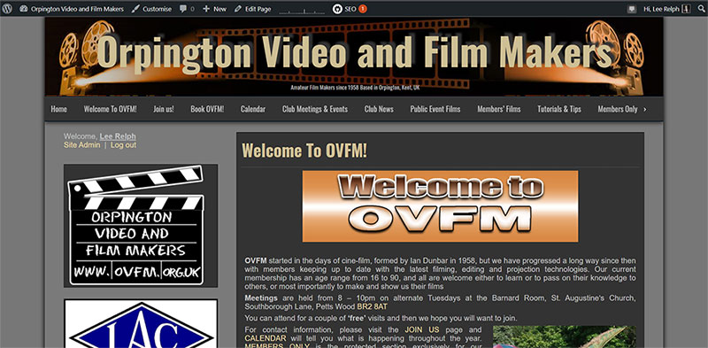


If you are NOT logged in to the site you can tell by three ways:


1) You get this error message shown earlier when trying to access any private post or those located in the Members’ Only section:


2) There is no black activity bar at the top of the page with your details:


3) Scroll down a bit and the login function, which is permanently located on the LEFT HAND SIDE of the home page, BELOW the menu bar and ABOVE the OVFM Clapperboard logo, where in GOLD text , reads “Login” and not your name:


Admittedly the text for the “Login” link is a bit faint which is a drawback of this particular theme being used for this website but hopefully the above diagram will suffice in showing you exactly where it is.


To rectify this click on the text link “Login” and you will be taken to the follow page:


Enter your USERNAME and PASSWORD exactly as it is given to you in the respective boxes shown below, making sure to check the “Remember Me” tick box as shown above so you won’t have to log in again next time. Also, if your browser has the function to store passwords, use that too.


N.B – Occasionally you will be automatically logged out of the website because WordPress cookies have a short life span, so using the “remember me” or your browser’s password storing function will ensure you don’t have to enter your login details every time.


REMINDE R- Please DO NOT use the “Lost your password?” link on the sign in page as that is an automated service it goes directly to WordPress and doesn’t go to me, thus I have no control over what they send out in response. Please contact me directly instead.


Once your login details have been accepted you’ll be taken back to the home page where you will now see the black activity bar at the top of the page saying “Hi” and your name:


And your name and welcome message where the login instruction once was:


You are now “logged in” to the website and can access the Members Only section. Also note that if a regular post has been made “Private” it won’t show up on the latest posts list on the left hand side of the homepage until you have logged in. Simple eh?


I hope that is clear for everyone and now you know what to do if you are ever faced with the dreaded “Oops” error message again!


Remember, if you need a password my e-mail is leerelph@hotmail.com


Thanks for reading.

COLOUR GRADING II


We return to the subject of colour correction and colour grading as I have been working more on learning how to transform my images from flat, over/underexposed, over saturated or bland, to something more vivid and eye catching. It’s a process the footage on pretty much every major film or TV show these days undergoes to give it life, atmosphere, and tone and many modern filmmakers and editors use it on their clips, no matter how short they are to give them a boost.


You may recall the first article I did on colour grading which featured my first attempts at cleaning up older footage from the OVFM archive as part of the showreel I made. I hope this article will show improvements in my understanding and application of this fiddly, trial-and-error process but a worthwhile one.


The footage being graded here is courtesy of Chris Coulson and Anna Littler, formerly of OVFM and now running Rentadinosaur, shot on an iPhone in HD 1080p at 30fps and used in the latest showreel I edited for them. It was edited using Premeire Pro CC 2018.


First, please look at this video detailing a number of shots from the showreel with “Before” and “After” examples, followed by a breakdown of the four stages of colour grading used in each case:


As you can see, the environment and lighting quality of the different clips demanded different levels of grading to create a consistent look for the showreel, though I am not yet at the stage where I can make any clip from any source look identical. Hopefully you also noticed that even though the results from each stage might look either subtle or counterproductive on it sown, they are play a vital part in the end result.


Now, let’s take two different shots from the above video and show you the settings I used in each of the four stages to achieve the colour grades I wanted.


EXAMPLE 1


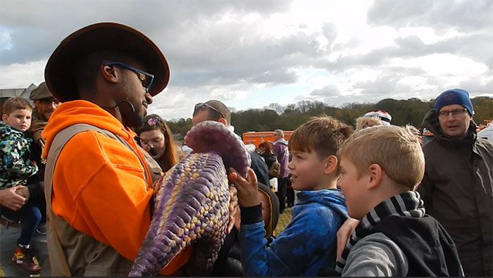
BEFORE


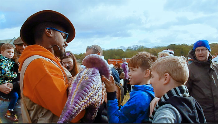
The overcast sky is the first notable thing in this shot, along with the bright orange jacket and general flat look.


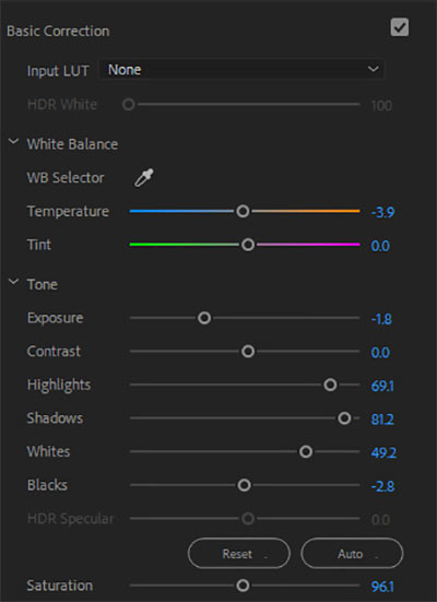
STEP 1 – BASIC CORRECTION


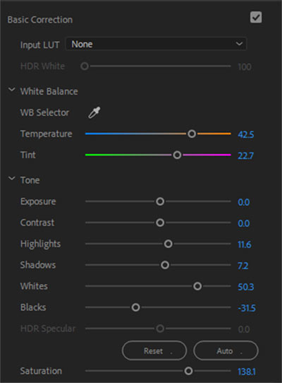
Here I lifted the blacks, and boosted the shadows and highlights to add some depth, cut the saturation and exposure a little, and moved the temperature slider towards the blue to give it some colour. It was necessary to cut the saturation due to the brightness of the orange jacket but this can be fixed in later stages.


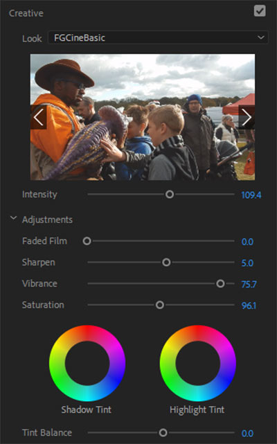
STEP 2 – CREATIVE aka LUT


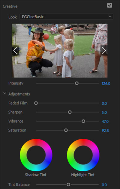
This LUT (Look Up Table) is FGCineBAsic, which I believe is a preset within Premiere Pro. Only minor adjustments here as the default settings mostly provided what I wanted. The intensity is boosted a little as is the sharpness and the vibrancy, whilst again the saturation is cut a little because the vibrancy actually does most of the work, and cutting the saturation keeps the colours from being too strong without losing their tone.


STEP 3 – CURVES


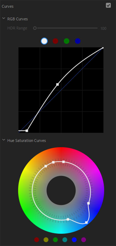
Two curves in use here – general and hue/saturation. In the first I have lifted the black base to give the darker areas in the image a lift without overpushing them in the basic correction settings. The curve in the centre lifts the lightness without flooding the whole image, a very important feature to be aware of and to master.  For the Hue curve, I’ve boosted the blues whilst kept the orange very stable. Quite often this doesn’t seem to make a difference at first but when you start cutting primary colours, the effect is palpable.


STEP 4 – COLOUR WHEELS


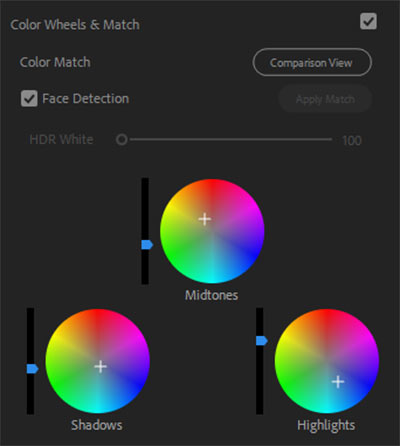
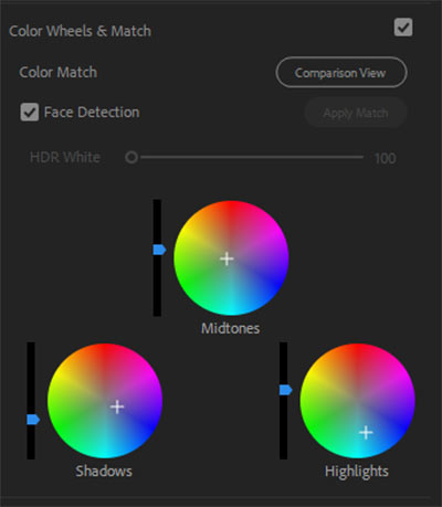
These three wheels make a huge difference to the look of the image as they set the colour tints of the three main facets of its construct. The trick here is that if you boost one colour, you ideally need to counter it by boosting its opposite – like here, the midtnes are more in the orange, so the highlights are set in the blues then boosted above the midtones, which is how the sky in the finished image changes colour, whilst the shadows are kept pretty much neutral colourwise.


AFTER


It might seem like the blue are overpowering the image but the intention was not only to make the day look brighter but also to create a filmic look and in this case, the usual trick of boosting orange wouldn’t work due to the orange jacket.


EXAMPLE 2


BEFORE


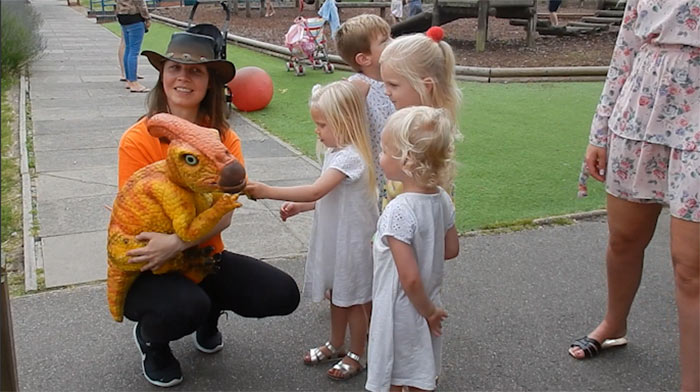
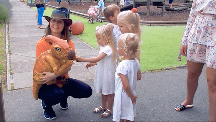
There might not seem anything outwardly wrong with this image, but it is a bit flat, the girls dresses look dull, and the light looks a bit gloomy for a summer’s day.


STEP 1 – BASIC CORRECTION


The first thing you’ll notice is the temperature is set towards a warmer tone whilst the tint is leaning towards the reddish end, which becomes more important later on.  The highlights and shadows are centralised for the moment with the blacks cut and the white boosted to give it a lift. Saturation has been boosted but this is dealt with in the next step.


STEP 2 – CREATIVE aka LUT


A combination of  reduced vibrancy and saturation to the LUT help level out the saturation boost in the previous step, Aside from the higher intensity, very little was changed here.


STEP 3 – CURVES


Because the blacks were lifted in the first step, there was no need to alter them here, so the only change was to lift the middle of the image to keep the edges dark. For the hues, the blue are again boosted but only slightly this time.


STEP 4 – COLOUR WHEELS


Since the image only needed minor adjustment to give it some life, only the highlights were again give  push and the darker shadows cut, just to give them a some presence.


AFTER


Now it isn’t so grey and gloomy, the dresses are whiter and there is more detail in the creases folds and depth to the image. The colours may not be bursting out but the overall feel is more serene and amiable, since the focus is the three girls.


I hope you have learned something from this article and maybe even inspired to try it yourself. I can’t profess to being an expert and I am sure not every example shown will be to your tastes, but it is a vital part of film editing these days and I am keen to improve. I realise that your editor might have a different set up for colour correction and grading, but I hope you can use these settings as a guide to know what to look for in your set up.


The secret to good grading is creating a memorable and striking look for your footage that doesn’t look like it has been graded at all, depending on what you want the visuals of your film to convey. Maybe one day I will get there and perhaps so will you.


Thanks for reading and happy grading!

OVFM CLUB MEETING TUESDAY NOVEMBER 19th


No this isn’t a case of deja vu, we have a second week where the theme of the meeting is another practical evening.

No this isn’t a case of deja vu, we have a… hold on didn’t I type that already?

Anyway, the idea behind this week’s session is to follow up what was learned at the last meeting about lighting. Much information was imparted about how to light a scene, what type of light to use and where to position it and now it is time to put it all to good use.

David Laker will be running the evening along with a little help from Andy Watson and Trevor Rogers. They will be bringing the club camera and lights but ask club member attending to bring their own cameras and any lighting gear they may have that will help add to the production.

In lieu of any other ideas, David has come up with a scenario he would like to use which will allow a chance to try out the various ways to alight a scene. If anyone has an idea of their own they are welcome to bring it to the meeting and time permitting we may get to try them as well, and hopefully even get to check the footage on the club PC before we wrap up for the evening.

So, it might be dark outside but it will be anything but when you join us this coming Tuesday for an illuminating evening of filmmaking!

OVFM CLUB MEETING TUESDAY NOVEMBER 5th


It’s time to get out hands dirty again by putting what we’ve learned to good use for another OVFM practical evening. This time however, the session will be more of an educational one as we delve into the subject of lighting, one which has proven a perennial thorn in the side for filmmakers the world over, even in professional circles.

With new members recently joining the club looking to improve their skills and learn new techniques, this was a requested topic and a challenge gladly accepted by our chair Jane Oliver on behalf of our resident brains trust (who just happened to be absent last time, so this is their first time hearing about this).

As you are aware, the club has their own set of lights for us to work with, plus many members have either their own lights or helpful accessories like reflectors or filters which we encourage them to bring with them on Tuesday.

So, if lighting is a bug bear for you when making films and you want to learn how to fix or improve it, the the place to be is at the Barnyard Rooms at St Augustine’s in Petts Wood next Tuesday evening!

Bit(Rate)s & Pieces

BIT(RATE)S AND PIECES


During the recent Top Ten competition Jim Morton-Robertson’s film wouldn’t play on the club’s Blu-ray player. The picture would stutter every few frames as it struggled to process the footage.


I noticed that the file size was 1.42Gb which was ludicrously large for a 3 minute film so I asked Jim to check the bitrate of his clip, which was 64582 kbps. Jim changed his export settings, this time producing a file with a much more suitable bitrate of 16055 kbps and a far more appropriate file size of 365Mb.


But what does this all mean and why does it matter?


To start with a brief explanation of video bitrates.


Digital video is made up of bits and bitrate refers to the number of bits processed in a set amount of time, listed in kilobits per second (kbit/s). This usually determines the file size as 1 byte of data is made up of 8 bits, so 1Mb of data = 8 megabits (Mbit/s) or 8000kbit/s. The ultimate file size is therefore decided by the sum of the formula Bitrate x Duration.


Jim’s film might have a resolution of 1080p but with a bitrate of 64582kbps (64Mbitp/s) crammed into just 3 minutes, it contained the same data as a 4K file, which our Blu-ray player clearly isn’t capable of handling. As this was a setting oversight that was easily corrected, it is worth sharing this with everyone to be a bit more diligent when exporting your files in the future.


So why do we need high bitrates?


As cameras become increasingly capable of capturing ultra HD images (6K is already here) this needs to be reflected and replicated in the films we produce, so higher bitrates will ensure better quality film clips.


However this is more for the benefit of online streaming. Many of these sites, like YouTube, are notorious for compressing the hell out of clips uploaded to their platforms, so users have to export them at a higher bitrate (eg: a 1080p file encoded with a 4K bitrate) to trick them into thinking they are compressing a bigger file, ensuring decent quality post-compression.


YouTube suggest the following bitrate settings for uploading to their platform:


SD (DVD quality) 480p = 2.5 Mbit/s / 2500kbit/s

HD (Blu-ray quality) 720p = 5 Mbit/s / 5000kbit/s

HD 1080p = 8 Mbit/s / 8000kbit/s

HD 1440p (2K) = 16Mbit/s / 16000kbit/s

HD 2160 (4K) = 35-45 MBit/s / 35000kbit/s / 45000 kbit/s


N.B – These targets are based on SDR (Standard Dynamic range) whilst HDR (High Dynamic Range) aka Ultra HD, would require higher target values.


What about for playback at home on TV or PC?


The truth is you can get a perfectly fine looking HD clip for playback on your TV and PC without needing extremely high bitrates because the files aren’t going to be compressed. The only stumbling block will be the capabilities of the device you play them on, whether they have are able to accommodate current codecs – preferably H.264 for MP4 files.


As we mainly use 25fps SD/50fps HD, the following suggested basic bitrate targets are based on these parameters, again based on SDR bitrates:


SD (DVD quality) 480p = 1.2 Mbit/s / 1200kbit/s

HD (Blu-ray quality) 720p = 2.5 Mbit/s / 2500kbit/s

HD 1080p = 5 Mbit/s / 5000kbit/s

HD 2160 (4K) = 10 Mbit/s / 10000kbps


N.B – The following illustrations are from Adobe Premiere Pro CC 2018. Your editor may have different settings and options.


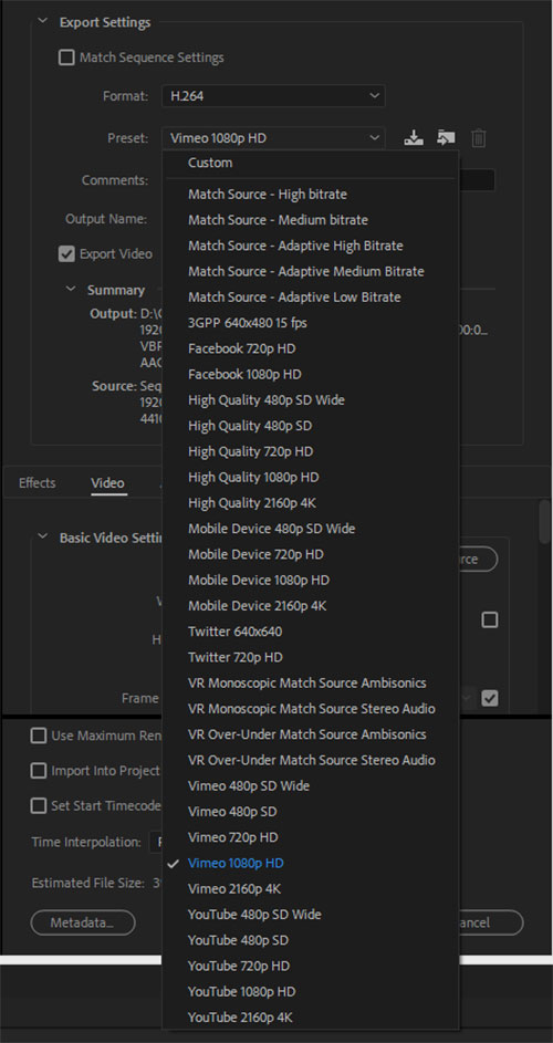
Your editor/encoder should offer a range of different settings and options for exporting your files, to cover all file formats, codecs, devices and streaming platforms. To wit:


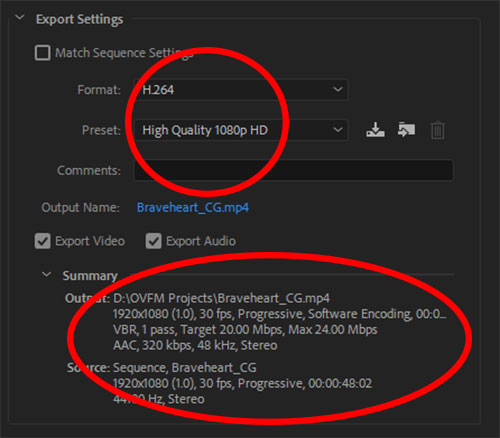
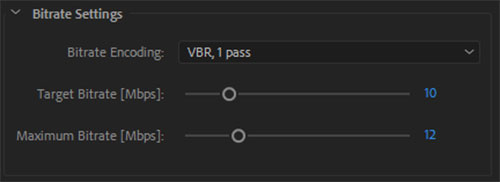
One thing which is standard is suggesting a “target” and “maximum” bitrate depending on which settings you choose. For 1080p HD this will be around 20 Mbit/s (target) and 25 Mbit/s (max) though they will usually come in around 15-18 mbps.


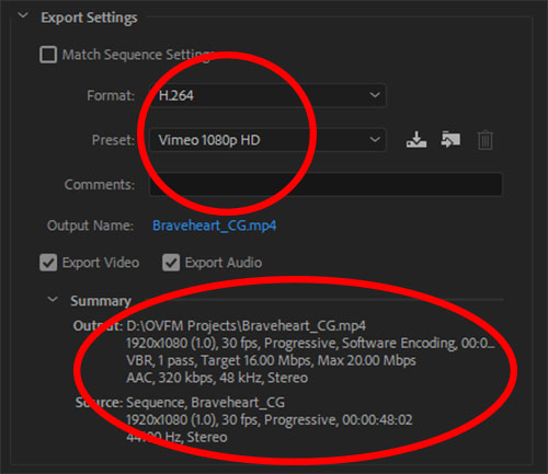
Here you can see there is a preset which will encode the video suitable for uploading to Vimeo, with the following settings:


However, you could still get a good quality video with bitrates half these sizes. For those unsure of what to select, you can trust the  presets of your editor/exporter and use the “Match Source” option to replicate the project/timeline settings.


These values are easily adjustable, either manually or by changing the output resolution in your project/timeline, for a higher setting if you want a better quality film. Even with a high bitrate, the output result is still in line with the YouTube suggestions yet won’t produce and excessive bitrate or file size.


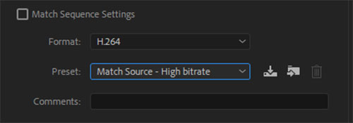
This example is the automatic setting from the Match Source – High Bitrate option:


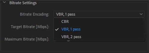
To complicate things further, there are two kinds of bitrates – Variable (VBR), a dynamic setting which only peaks when the video detail requires it to, resulting in a smaller file size, and Constant (CBR), which stays at one rate throughout, but means a larger file size. Both have their benefits and setbacks, but most editors will default to VBR so the choice is made easier for you.


You’ll notice that there are two VBR options Pass 1 and Pass 2. Pass 1 analyses how much bitrate is required and therefore is a quicker encode, Pass 2 will render the entire video compression thus yields a better quality images but takes considerably longer (many hours!) to encode and export, so most people tend to stick to Pass 1.


How do I check the bitrates of my files?


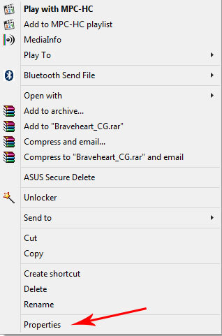
Very easily. If you are using a Windows PC simply right click on the file and a new window will appear. Scroll to the bottom and select “Properties”:


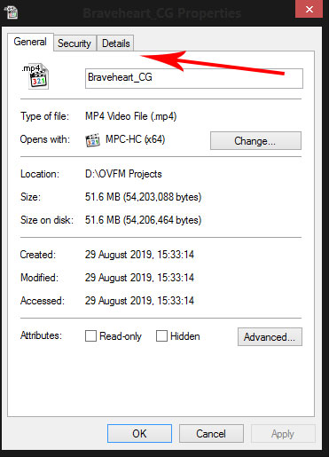
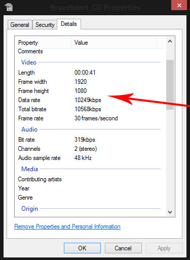
In the window that opens, select the “Details” tab:


The main information is the “Video Data Rate” and “Total Bitrate” , the latter being the more crucial one.


For the more advanced user, I can recommend a tool you can download for free called MEDIAINFO which will tell you everything and more in great detail.


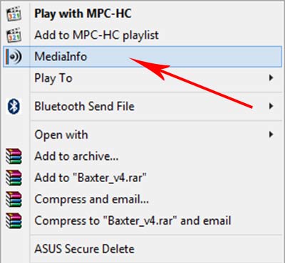
Once installed, as above, simply right click on the file and select “MediaInfo” from the option window:


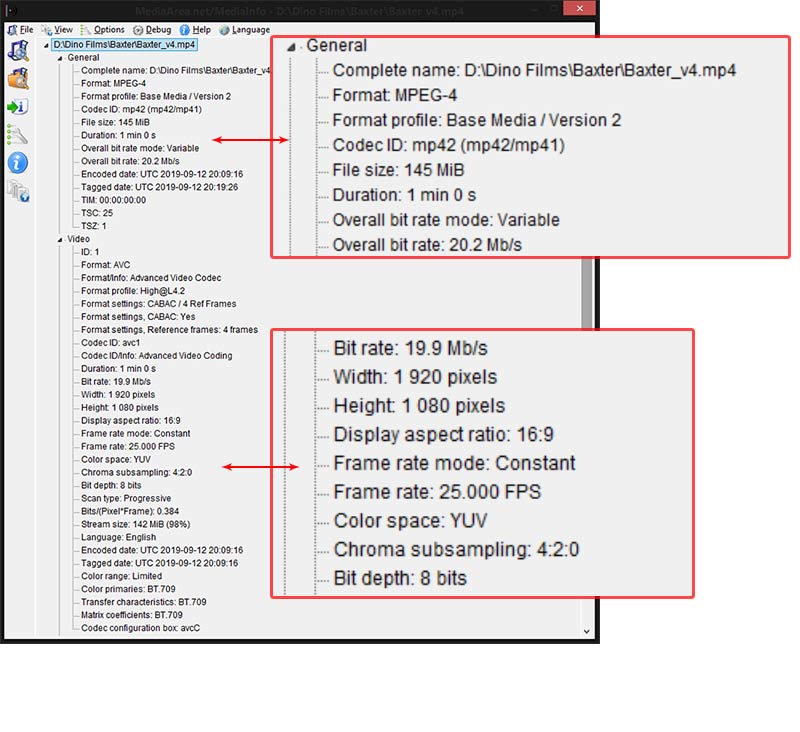
Every detail about the file from the video encode to the audio and more is there for your perusal:


Hint – Make sure to go to “Options” then “Preferences” to set the “Tree” view in this illustration as default as this is easiest one to read, but not the default setting, otherwise select View from the top menu then “Tree”.


I hope you found some of the information here useful. I appreciate the technical side regarding bitrates might not seem easy to comprehend at first (I don’t understand half of it either!) but the message here is more about alerting you to this issue and hopefully avoid any future situations where the club Blu-ray player can’t play your files.


Thanks for reading.
(More) COLOUR CORRECTION


Hopefully, you will recall John Epton’s video tutorial on this particular subject and my companion piece article explaining the benefits of colour correction and colour grading to our films. Since then I have been delving deeper into the practice of colour correction and learning more grading techniques to give my films a bit of a lift, and now I never leave a single frame untouched.


As my eye has gradually become acclimatised to this aesthetic phenomena it is possible to spot when a film has been graded, or had some correction applied to it. During the most recent Top Ten evening, our chair Jane Oliver showed her part black and white, part colour film Braveheart. It was beautifully shot as ever but for me the images didn’t leap out of the screen as they could have.


I asked Jane if she added any correction or grading and she admitted she hadn’t, so with her permission I downloaded an older version of her film from our Vimeo account and set about applying some basic (or primary) correction some of the shots. I can’t say they are perfect or to professional standard but are good enough for an illustration of what can be achieved.


N.B – Because some of the footage was shot in the dark there is some noise present on a few clips. Unfortunately, my editor doesn’t have a noise reduction function to clear this up – Resolve, however, has an excellent one – so you will witness some attempts to disguise this by making some of the clips a bit darker.


The following video features “before” and “after” examples of how even basic colour correction can add so much punch to your images:


Straight away, you can see how much difference it made to the black and white footage, the simple raising of the shadows and darker areas and shifting of the lighter areas to create a sense of depth and definition to the image. There is now balance between the various shades of black and white where before everything was one shade of grey, and individual features stand out more prominently.


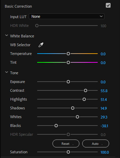
Here is an example of the settings I used (my editor is Premiere Pro CC 2018) and the clip it pertains to:


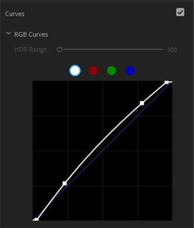
The secret weapon in this case is the curves, which adds the final tweaks to the brightness and contrast of the image with greater precision, yet is the most subtle of all the correction tools:


For the colour clips, it might be that they are too dark for some tastes. Shooting at night or in low light is hard to get right and, as mentioned earlier, invariable incurs noise on your clip unless the camera is set-up properly and the scene is appropriately lit.


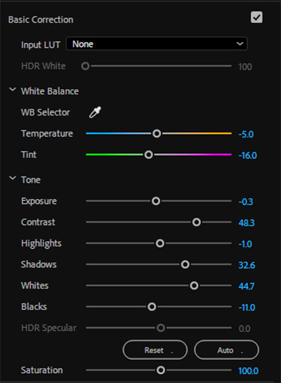
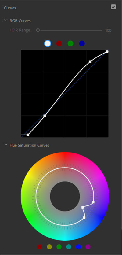
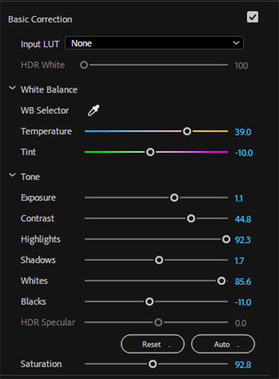
This almost required different correction setting, including some finer touches brought out by using the temperature and tint sliders:


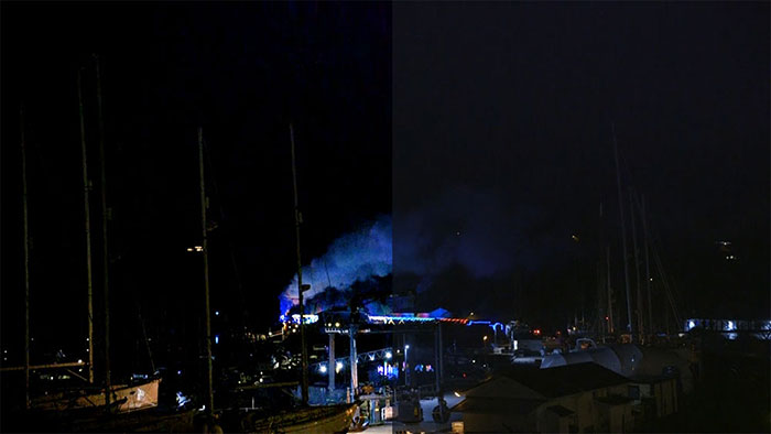
In trying to compensate for the noise in some the shots I made the sky and surrounding areas a little darker which enhanced the brightness and colours of the lights, as well as adding depth to the refracted light on the walls and trees, etc. Admittedly I did use some extra tricks here to give the colours a lift but not to the extent of overhauling the entire clip.


For instance, I cut back on some of the blues to allow the other colours to shine as represented by the colour wheel:


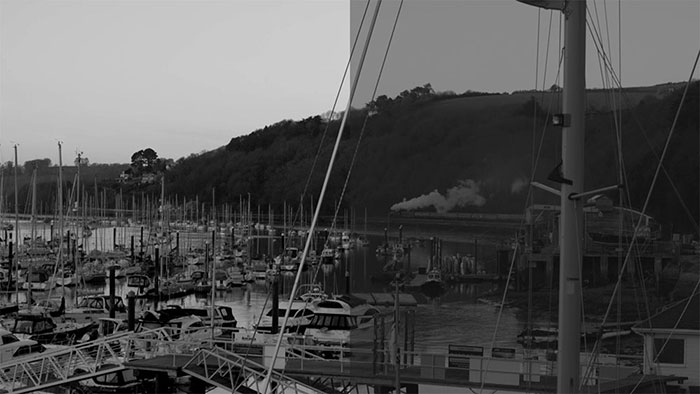
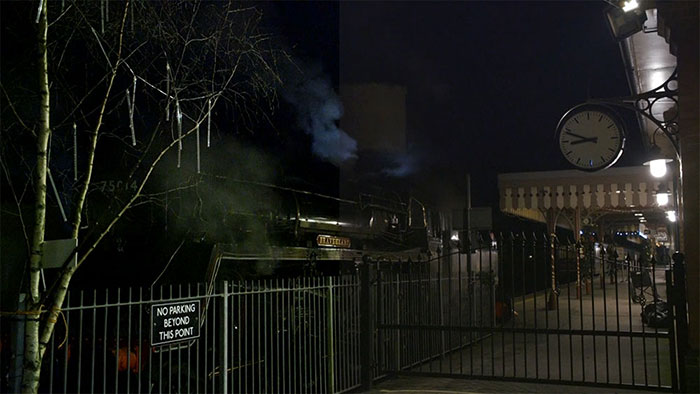
Whilst in this clip, you can see the smoke cloud is barely defined and the colour of the lights almost imperceptible, but after correction the vividness of the blue come through very clearly:


It might look intimidating or even voodoo to some of you but it really isn’t. It is time consuming when you first try it but after a while, things fall into place and once the basics have been mastered it is simply a matter or making the other bits work in tandem with them. And remember, everything I did here was quick and basic for the sake of this demonstration – had I attempted a full colour grading, it would be much different!


And the best part of it all is that YOU can do it to. Yes, you. It really is as simple as moving a few sliders about (depending on your editor’s layout) and recognising where best to cut or boost the corresponding part of the image.


Like most things, it takes a while and plenty of trial and error at first, but it will fall into place eventually, and you’ll find colour correction will be as natural to your editing process as adding a transition or title. The key is not to look at it as more work but as making your images that whole lot better.


I hope you found this article useful and the video will encourage you to try basic colour correction for yourself to get the best out of your images. Whatever editor you use, there are bound to be online tutorials to show how it’s done – that is how I learned it – and if I can do it, you can do it too.


Thanks to Jane for the use of her footage and thank you for reading!

NEXT OVFM CLUB MEETING – Tuesday June 18th


CHRISTINE GREEN


For this week’s meeting we get to take the weight of our feet and lt someone else do all the hard work as we welcome another guest speaker to our humble club. This time we shall be hearing from artists and graphic designer Christine Green.

Christine was born into a family of artists, ranging from graphic design to photography, so this naturally became a major focus of her life too,  in a career that has seen her create many titles and graphics for the BBC, as well as contributing in other areas such as costume and set design and even directing educational programmes on the arts. Nowadays, Christine concentrates on her work with textiles but it is her time as a title designer for the BBC that will be the main point of her presentation, when she drops by this Tuesday evening, with many stories to tell, advice to give and an impressive showreel in hand I am sure.

To learn more about Christine, visit her website – https://christinegreencrafts.co.uk/

See you then!

Colour Grading

by

Lee Relph


You may recall last year John Epton held a talk on colour correction and colour grading (the video is HERE in the Members’ Only section) as an important step in the editing process. Editing suites have come a long way over the past decade or so and their colour correction facilities in particular have become much more sophisticated in what they can do for our footage yet are relatively easy to use.

Thanks to these developments it is now possible for amateur filmmakers like ourselves to create better looking clips and films and depending on the software – with an industry standard colour graded aesthetic. It can also help spruce up any old footage recorded on archaic formats like mini DV or video tape, give them a new lease of life, and not look so dated in comparison to modern digital output.

Recently I compiled and assembled a new SHOWREEL for the club for which I delved into the available archive of OVFM for snippets to use to showcase the array of films we have made over the past 60 years and the different genres. However, because much of the content was so old, the quality of the footage not only showed its age through faded colours or overexposure but also stood out against the pristine veneer of current clips shot with digital cameras.

This presented me with a challenge in trying to rectify this with a view of creating some kind of consistency across the whole presentation. If I’m being honest, this was possibly more time consuming than animating the text in the clip which in itself was a lot of trial and error! Luckily, I am currently using Adobe Premiere Pro CC 2018 as my editor which has an excellent and intuitive colour correction tool that was very much up to such a task.

Premiere Pro’s basic correction tools would have been sufficient in restoring some of the major picture elements (like contrast, exposure, highlights, saturation, etc) to something resembling their original state but a fairly recent and very handy tool to add extra depth to the colour is the LUT – Look Up Table. I don’t know if these have crossed over to other editors but a LUT is basically a preset to be added to a clip that has been set to create any kind of tone, atmosphere and colour boost to get the image you want.

Using LUTs is how we can achieve the professional looking colour grading I referred to early, by altering some of the picture’s dynamics to replicate certain looks, as well as the setting of specific cameras. These are not fixed so one can fiddle with them to suit their needs otherwise you can simply apply them to your clip and transform it immediately.

The most popular LUT among editors today is teal and orange which, as the name suggests, manipulates the blues and oranges to create a bright and vivid look and bring out some interesting hues in the process. You’ll have seen this effect used in many recent film, TV shows, and adverts which show off its flexibility. I also used it here too, as you will see in this selection of examples from the showreel of my own attempts at colour correction and grading.


Please note the image on the left is the original untouched footage whilst the image on the right is the “corrected” version. Click the image for a large version.


As you can see in this first example the original clip is lacking in depth and definition, and the colours are rather washed out as a result of being shot in natural light on tape then later digitised, losing a lot of its lustre. By altering the basic settings then adding the teal and orange LUT with a few minor adjustments, the new version looks and feels warmer and the colours and details stand out more:


The next example isn’t perfect giving the age of the original clip but I feel it has more definition and the geisha stands out more as again, the natural light seems make everything seem flat. The teal and orange LUT also give the background a bit of a lift too:


Also note that I used an additional mask to clean up the geisha’s yellow teeth:


One of my own clips now to show that even digital photography doesn’t automatically guarantee perfection. This was shot with my nephew in the living room and me in the adjacent dining room, with the main overhead light in the living room coming through orange tinted bulbs and the light from outside in the background. There is a slight compromise with the glare and exposure of the background light in the second image otherwise an overall improvement nonetheless:


This shot of the hot air balloons was another tricky one to get right because of the varied colours involved. I believe it was also shot very early in the morning so the light wouldn’t have been at its strongest and presumably on tape. The colours might look paler in the second shot but I would venture they are closer to how they were at the time, whilst the added depth to the landscape is more natural looking too:


Here’s another recently filmed shot on a digital camera that looks okay as it is but with the orange and teal LUT the blue skies are given a nice summery boost. Even the smallest touch can yield some great results:


The next two examples are from the same film, and I’d wager were shot on video tape! The first was a nighttime scene set during the war which was very hard to work with, as the light was intermittent thus there was no stability in the brightness or colour. Again, it was more about making the colours look more natural:


Clip number two from this film was shot indoors and whilst it looks alright, it is in fact lacking in contrast and everything is washed together by the light, perhaps a casualty of being passed through various different formats over the years. Being darker and less saturated brings out the “true” colours of the yellow jumper and the grey carpet:


Another very challenging older clip that was shot outdoors where the light reflecting off the snowy landscapes turned everything white! The orange and teal LUT gives the sky a refreshing blue tint as opposed to the pale mauve in the original to compliment the renewed sense of definition of the foreground objects:


Finally, the hardest clip of them all. Like the snow in the previous example, the location of the workshop dictates the lighting of the clip along with the age of the footage and the medium it was filmed on. As you can see, everything is bathed in green robbing the individual elements of their own colours and the picture of its depth. A lot of fiddling was involved in getting the exposure and definition right whilst our favourite LUT also needed some twiddling to restore the original colours to their former glory:


Now, I’m not going to say that these are by far the most perfect examples of what colour grading can do but I learned a heck of a lot in doing this and given my lack of experience and the quality and age of the clips, I am content with the results, and I hope this has been informative for you too.

So, next time you have a clip that looks a bit off or needs some tidying up, take a look at John’s tutorial on colour correction and, if your editor allows it, get some LUTs and make your old clips or your new footage look like a million dollars! There are plenty of further tutorials online about LUTs and colour grading so look them up and give it a go yourself!


Thanks for reading.

OVFM CLUB MEETING – Tuesday January 22nd


For this week’s meeting we are please to welcome Andrew Bishop back to give us another talk on his favourite subject of animation.
As you might recall, Andrew from Darkside Animations last gave a talk back in October where he showed us the latest software he and his team have been using in making the many TV shows, promos and commercials. This proved to be of such interest to club members that this time, Andrew will be holding a workshop introducing us to the basics of creating an animation.

Some of us have dabbled with animation in the past but this will be an opportunity to learn from a  professional. Don’t feel too daunted by this if you’ve ever thought animation was way out of your grasp, Andrew has promised to go easy on us and stick to the fundamentals to get any neophyte started.   

You never know, this might be the start of a new direction for you and inspire you to try something different for Film to a Theme projects, Top 10 or other competitions.

For a sample of the work Darkside Animations have done, check out THESE SHOWREEL VIDEOS on their Vimeo page.

So, bring your notebooks and a pen because animation class will be in session this coming Tuesday!

OVFM CLUB MEETING TUESDAY OCTOBER 2nd


For this week’s meeting we are taking a break from our own activities to let someone else share with us the fruits of their labours and the secrets behind how they achieved them., as we invite another guest speaker to the hallowed halls of the Barnyard Rooms!


We are expecting to have Andrew Bishop from Darkside Animations gracing us with his presence, a face and name that might be familiar to our older and longer serving club members from his previous visit to our club back in 2011! In case the name of his company wasn’t enough of a clue, Andrew is an SFX wizard with many TV show, films and promotional clips credited to Darkside Animations, a sample of which can be found in THESE SHOWREEL VIDEOS on their Vimeo page.


Visual effects are becoming the norm in film making these days even for what seems to be the most normal of circumstances – from unique colour correction techniques and the use of LUTs to speed ramping and masking to subtly enhance the images whilst keeping them look natural.


As we know from our own experiences green screen is also more common in what look like normal, everyday situations and no doubt Andrew will be able to share with us some handy tricks of the trade to helps us improve our understanding and film editing techniques, as well as dazzle us with the mastery of his own work.


If this is something that interest you, and it should, be sure to join us and Andrew this coming Tuesday for what should be a fascinating and educational evening.